Background
Established in 2010 by ITU, UNESCO, President Paul Kagame of Rwanda, and Mexican telecom magnate Carlos Slim Helú, the Broadband Commission for Sustainable Development is a global partnership bringing broadband affordability, access and use to the forefront of global policy discussions.
I am the only designer on the team.
I joined ITU’s Broadband Commission team in 2020 as a Brand, Web, and Graphic Design Officer – a mouthful of a title meant to encompass my lead role in every aspect of visual communications. On the daily, I work across print, web, and motion translating thought leadership and policy recommendations into successful advocacy campaigns.
The challenge
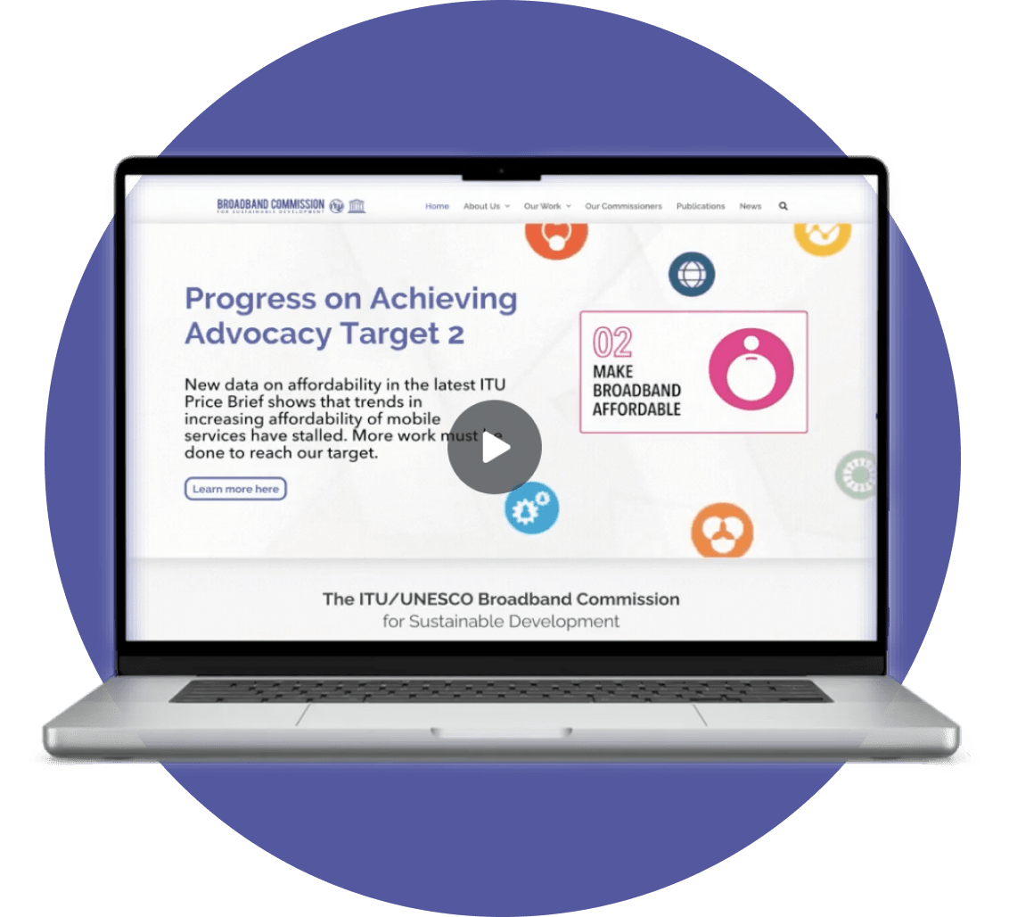
2020 marked the 10th Anniversary of the Broadband Commission, a fitting time to refresh the branding and visual identity of the Commission. In line with recommendations from the strategic task force, discussions were initiated to upgrade the website by migrating it from SharePoint to WordPress.
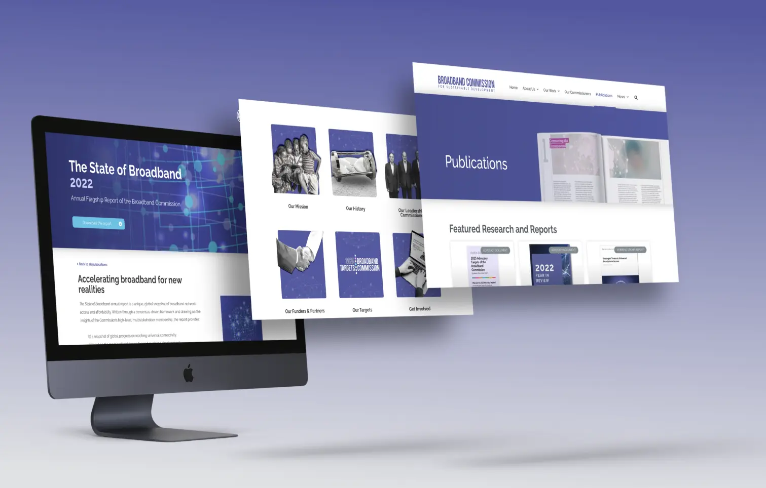
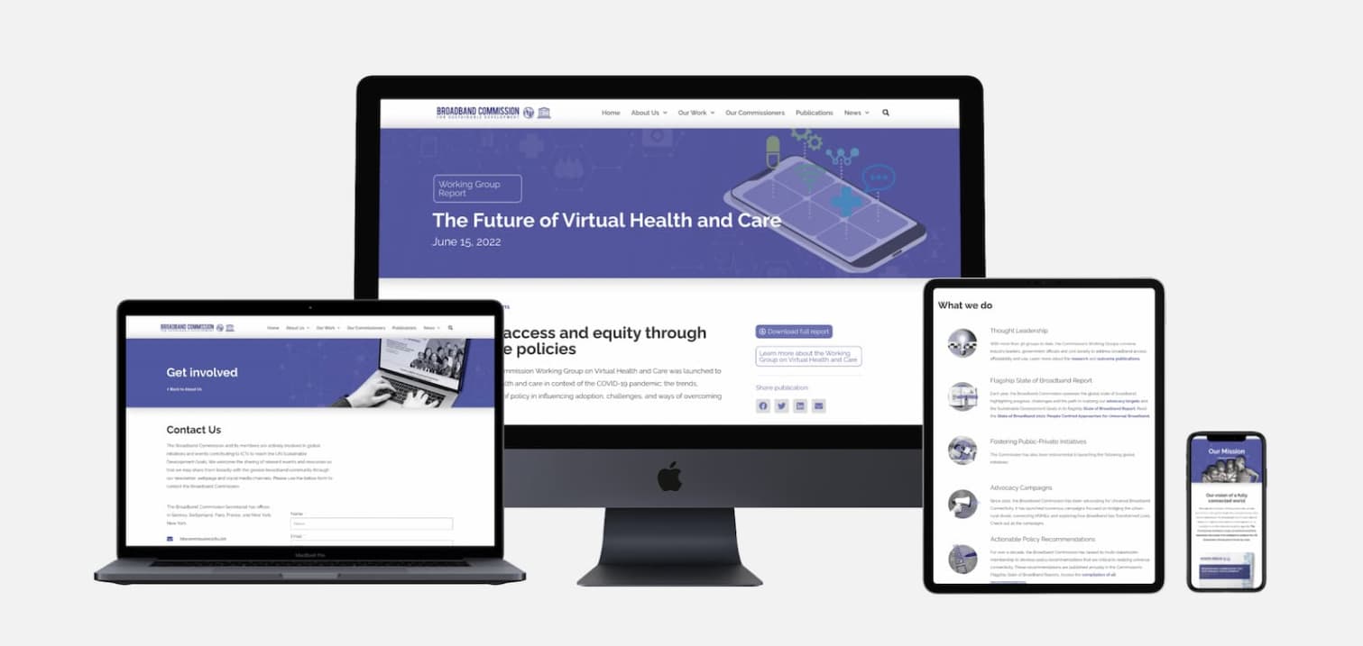
As lead web designer, I implemented a complete restructuring of the way the information and resources were organized and stored, ensuring responsiveness across all devices, with low-bandwidth users in mind, and introducing accessibility features.
The initial challenge was setting the right priorities to allow us to create an MVP within a month deadline. This meant focusing first on building a strong foundation through the information architecture, then facilitating a smooth migration that had SEO best practices top of mind – such as tagging, compression, and optimization. The fun part – the visual identity – came last, and continues to evolve as the Commission expands its reach and scope of work.
Information Architecture
Content Audit
To better understand the SharePoint site and its content, I audited the content and listed all available information and features. Based on this, I led discussions with the team to reach collective decisions on what content we should highlight, what is outdated and can be removed, and how the content can be integrated into a more intuitive information architecture.
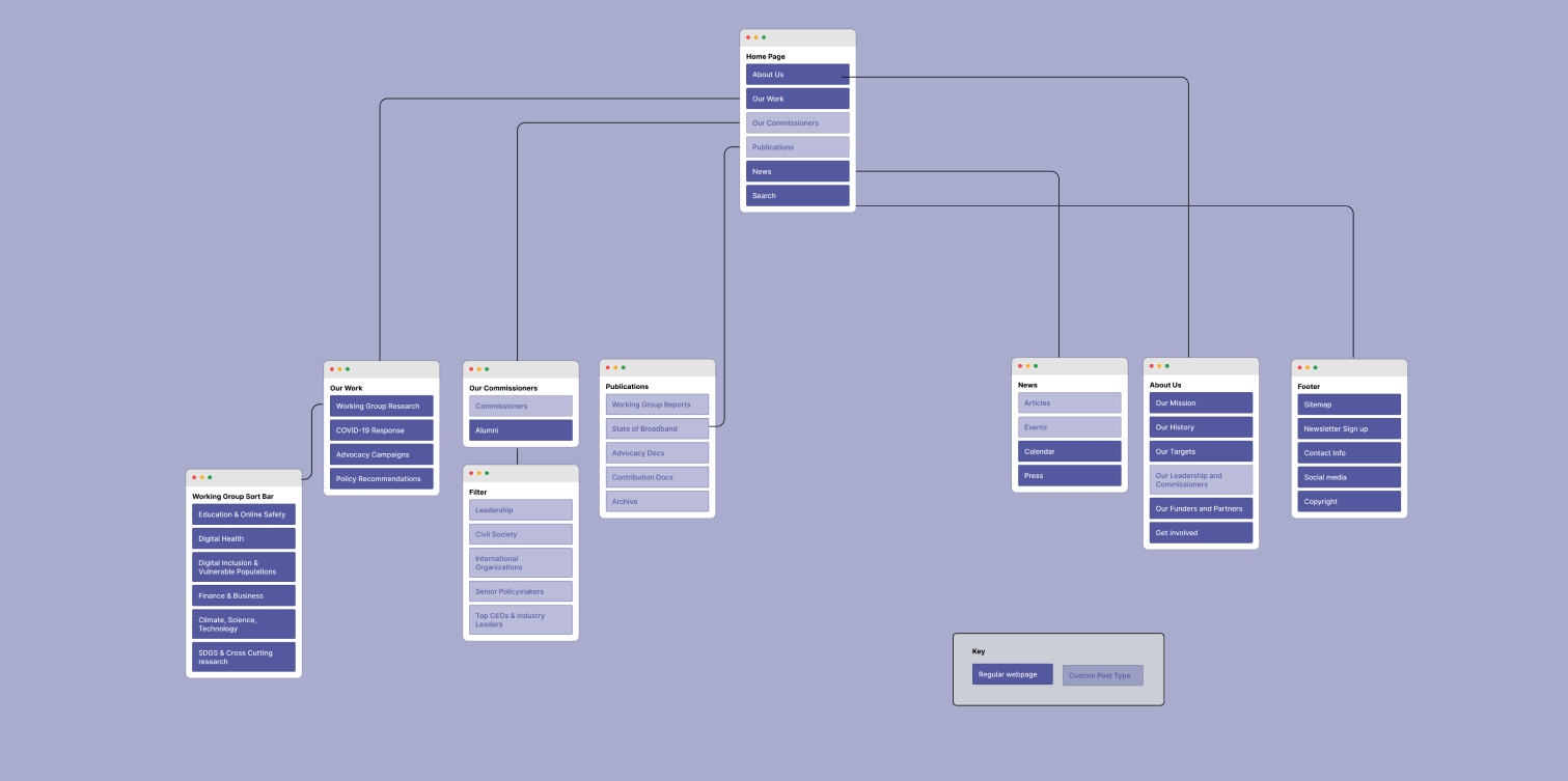
Sitemap
We developed a sitemap that considered the needs of two target groups – those familiar with the Commission ( including our own team at the ITU, our Commissioners & their focal points, and our partners) as well as the current audience of our reports (policymakers and industry leaders).
Learning areas
Had we had more time, I would have placed a greater emphasis on developing more proto-personas, to acknowledge the differences within our existing target groups and to take into account those unfamiliar with the Broadband Commission.
Developing a Visual Style
The website’s visual style was finalized after the migration. Through extensive peer-to-peer reviews with members of the Communications Task Force and expert ITU colleagues, we determined the Commission’s brand adjectives:
Modern.
Clean.
Professional.
Focused.
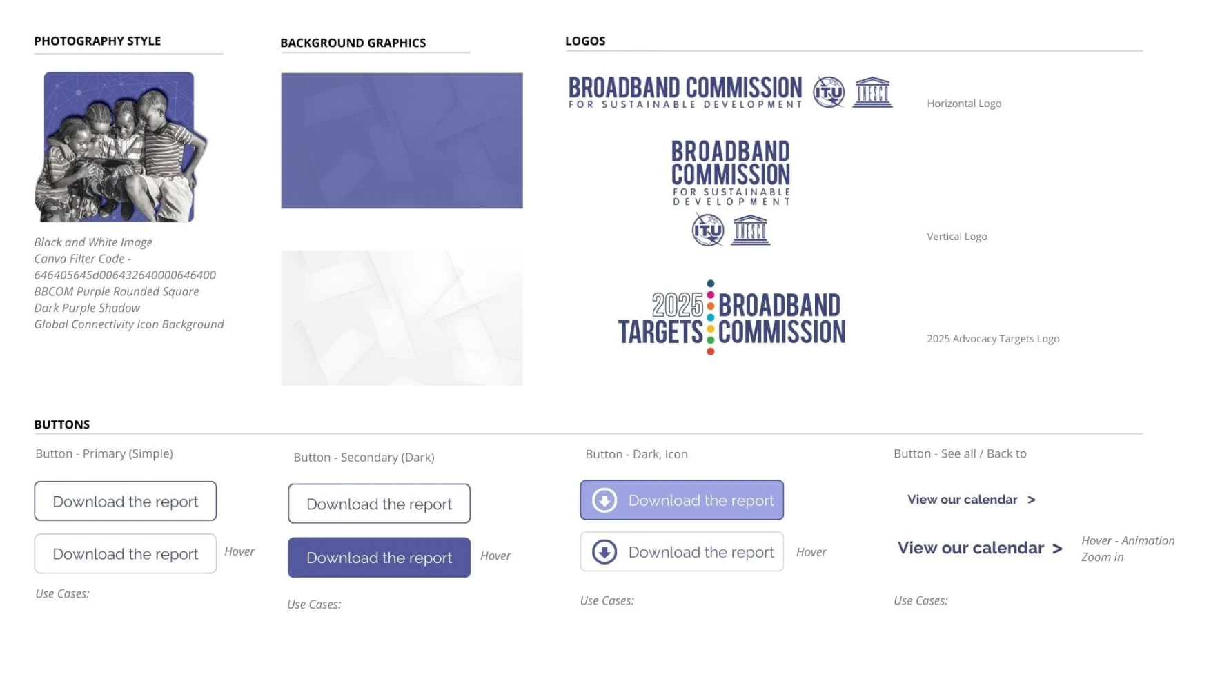
These characteristics guided the development of the visual identity and helped us establish consistency across all our communications channels, even beyond web. Functionality was a priority, as the visual identity had to be easy to replicate and use by non-design professionals.
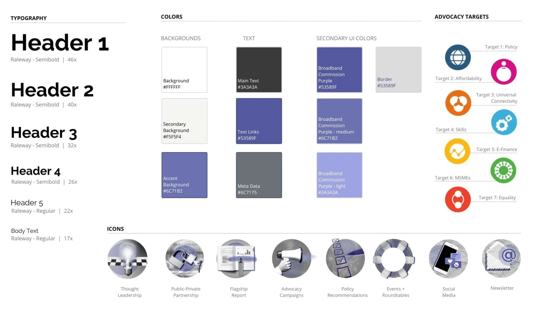
The resulting identity involved a simple color palette: Broadband Commission purple and grey/black/white. We strategically eliminated the previous yellow accent color, as the tone was low contrast/unaccessible and too complicated for use by non-designers. A single font was chosen for the typography: Raleway, a modern sans-serif Google typeface that can be downloaded for free.

To enhance the visual appeal of the photographs taken during annual meetings, which tended to be repetitive and monotonous, we added black and white filters and changed backgrounds to purple. This allowed us to create more eye-catching banners and thumbnails.
Lastly, we took a creative approach to the iconography. Tackling differentiation head-on, we digressed from the usual, single line icons and created small collages. While at first glance these collages may seem more complicated and labor intensive to create, the reality was contrary.
Because the work of the Commission was broad and ever-developing, no single ShutterStock icon library encapsulated all our needs. At the same time, developing icons for each new topic required continued access and knowledge of Adobe Illustrator, which was not guaranteed. The collage style icons solved both issues as they were created on Canva using existing photography and style guides. To facilitate this, I created a template on Canva explaining the step-by-step process. With the features already available, such as background removers and duotone filters, the collages could be created in minutes!
Click image to enlarge
The results
Since the migration, we have seen a decrease in bounce rate by 40%. While a recent organizational downgrade to a different server has impacted our current speeds, we continue to explore new avenues for improving speeds, optimizing content, and improving our SEO.
New features introduced:
- Google Analytics integration and monitoring
- Mailchimp integration
- Custom Post Type Templates
- Download Monitoring
- Responsive and Accessible Design
- Simpler navigation through streamlined tagging and keyword and CTA use
The work is never fully finished.
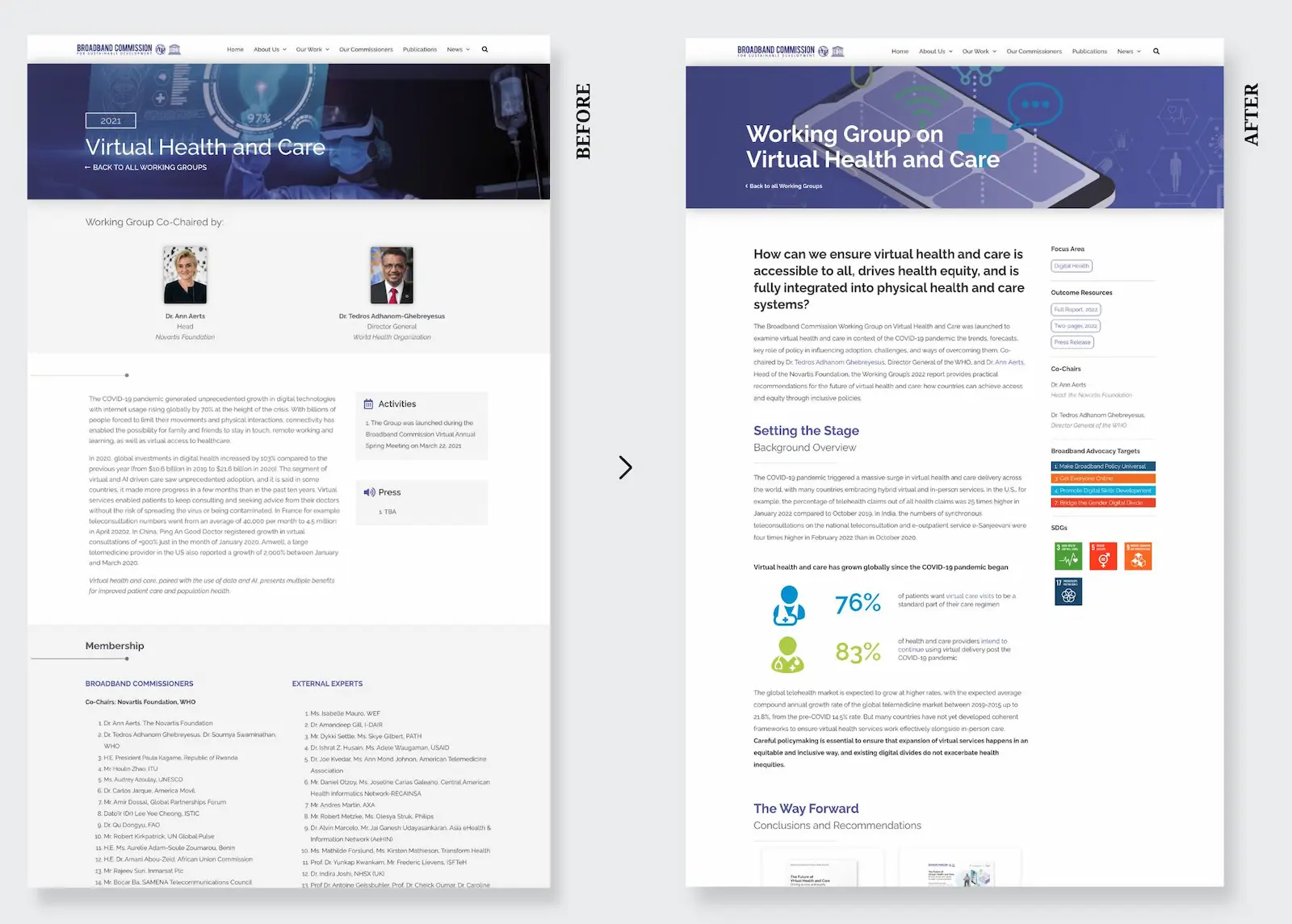
In 2022, we re-examined our approach to organizing and displaying the work of our Working Groups, a core output of the Commission. Reacting to feedback from users as well as trends in report design, we created a new template for all Working Group landing pages that displayed the outcomes and findings of the groups in an interactive format without necessitating the user to download the report. By populating the pages with more SEO-friendly content, we were also able to attract more traffic to the site and increase access to our content.

