Background
Throughout its history, Colombia has been home to a diverse range of cultures and communities that have coexisted and interacted. However, this history has also been marked by long-standing armed conflict, violence, and inequality, which have disproportionately affected rural and indigenous groups. These communities have found themselves in the crossfire of the conflict, facing significant challenges like displacement, loss of livelihoods, and limited access to resources and services.
In addition to armed conflict, many of these communities have also faced other forms of social and economic exclusion, such as limited access to education and healthcare, lack of representation in political and decision-making processes, and marginalization from mainstream society.
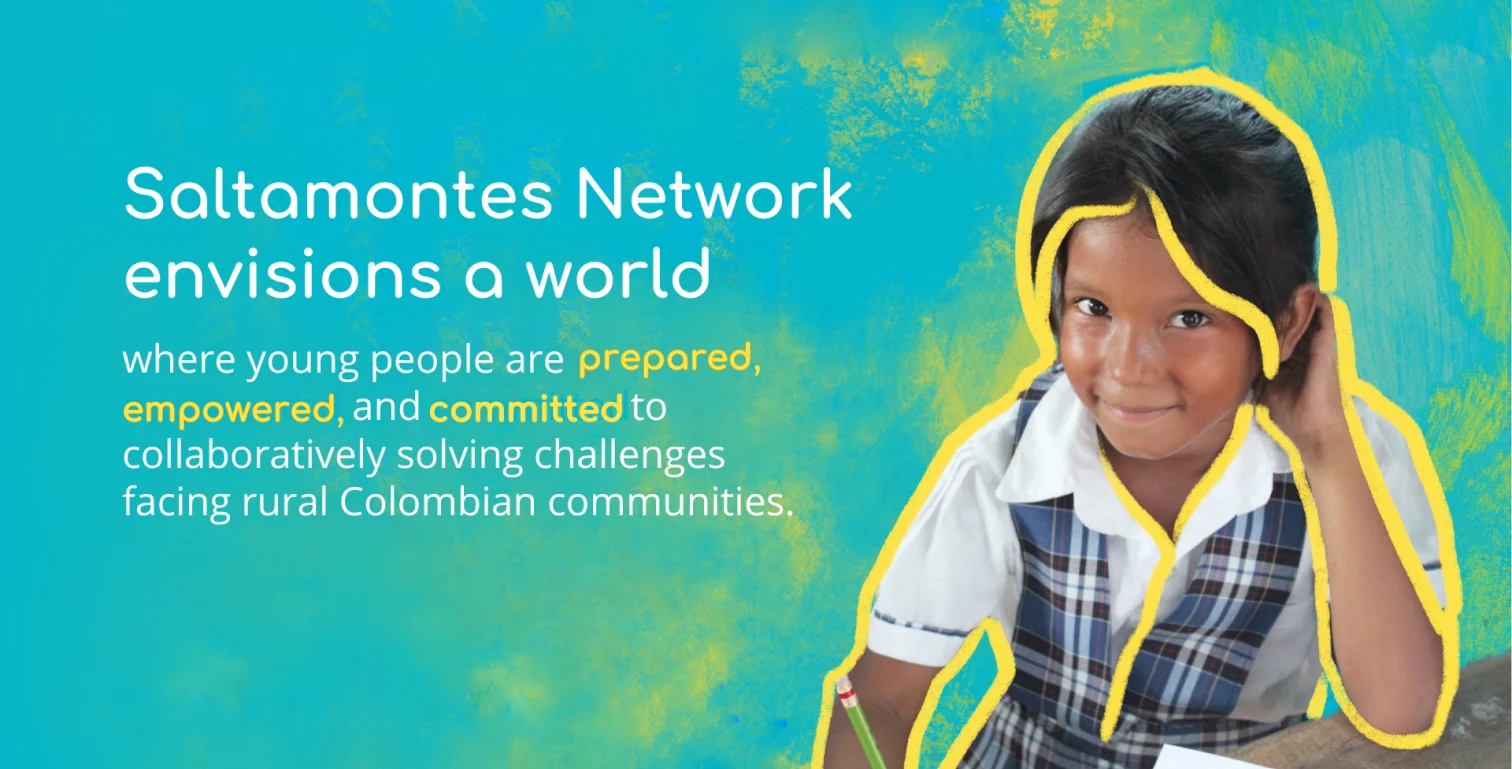
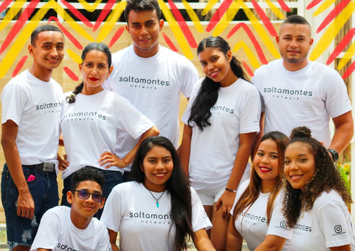
Saltamontes Network works to address these challenges and empower youth in these communities to drive positive change. The organization facilitates network building and provides leadership training, education scholarships, and other resources to help young people access the tools and support they need to become leaders and advocates in their communities.
The challenge
The biggest hurdle was simultaneously building credibility and differentiation. Upon its founding, Saltamontes was joining an oversaturated and often corrupt nonprofit space, where many organizations either benefit from tax breaks and donations with little oversight, or contribute to the proliferation of negative peace ( see below). Thus, it was important to create a reputable brand that differentiated itself from other organizations.
At the same time, the brand needed to establish credibility and effectively reach a diverse audience. It had to be inclusive for young people from various communities in Colombia, as well as build trust among American donors and Colombian government officials.
A brand built on positive peace
What is it?
Positive peace is a concept that refers to the attitudes, institutions, and structures that support a society in which violence is not necessary to resolve conflicts and achieve goals. It is often contrasted with negative peace, which is the absence of violence or conflict, but does not necessarily reflect the presence of positive qualities such as justice, equality, and respect for human rights.
Positive peace is an essential foundation for sustainable development and the achievement of long-term stability and prosperity.
Impact on programming
Saltamontes Network was founded on the idea of positive peace, which has influenced the way Saltamontes Network delivers its programs. The organization works to build strong, inclusive, and sustainable communities by fostering collaboration, empathy, and mutual understanding between different groups and individuals. This approach helps to create a sense of belonging and build bridges between different communities and cultures.
Impact on branding
The concept of positive peace also impacted the way we approached branding. We wanted the brand to reflect a fresh and innovative approach to conflict resolution in Colombia, and so we avoided using cliched symbols of peace and unity. Instead, we focused on capturing the unique spirit and character of the communities we were serving. Most importantly, we wanted the brand to convey a sense of hope and positivity
Defining what we stand for
Before delving into the visual identity of the brand, we needed to establish the mission, vision, and values of the nonprofit. I led several workshops with the founders, helping them repackage complicated backgrounders into concise and succinct one-liners. It was difficult but necessary to avoid using jargon like “socio-training processes,” and “positive-peacebuilding network.” This exercise highlighted the importance of providing context and explanations of these terms on the website.
Our values and voice
After conducting in-depth research and workshops, we arrived at the core values of the Saltamontes brand: empathy & humanization, reciprocity & co-creation, and life-long learning. We derived these principles from our understanding of postive peacebuilding and we captured them in an action-oriented tagline: understand, teach, connect.
We created a brand language built on compassion, support, and inclusivity, evoking the perfect environment for community building.
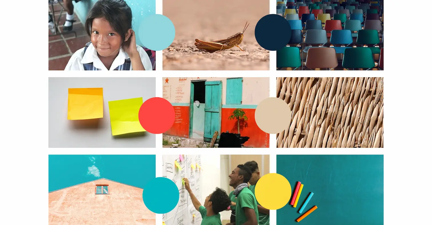
The moodboard & color palette
The moodboard communicates a colorful and unified aesthetic. It draws inspiration from the classroom, organic textures of the geography, and color-blocking designs found in both local and urban architecture.
The color palette was derived from this moodboard. It incorporates shades native to the landscape of rural Colombia and draws on a vibrant vision of positive peace, where vivid, rather than pastel, colors are sources of happiness and serenity. The combination of the primary colors ( red, yellow, blue) is reminiscent of grade school and strikes a chord with our main audience: students.
The primary palette consists of tart orange, golden yellow, blue green, and light blue. These saturated colors are complemented by the neutral tones of prussian blue, wheat and jet.
The audience
Saltamontes Network has three main audiences: Colombian students and government agencies, and international ( although primarily American) donors. Additionally, it serves a variety of secondary audiences: corporate sponsors, strategic partners, media, alumni, and academic professionals studying development, among others.
Brand adjectives
Adaptable: dynamic, evolving, responsive
Compassionate: friendly, young, human
Open: inclusive, accessible, collective
Innovative: professional, imaginative, refined
Uplifting: positive, safe, synergetic
The process

The logo
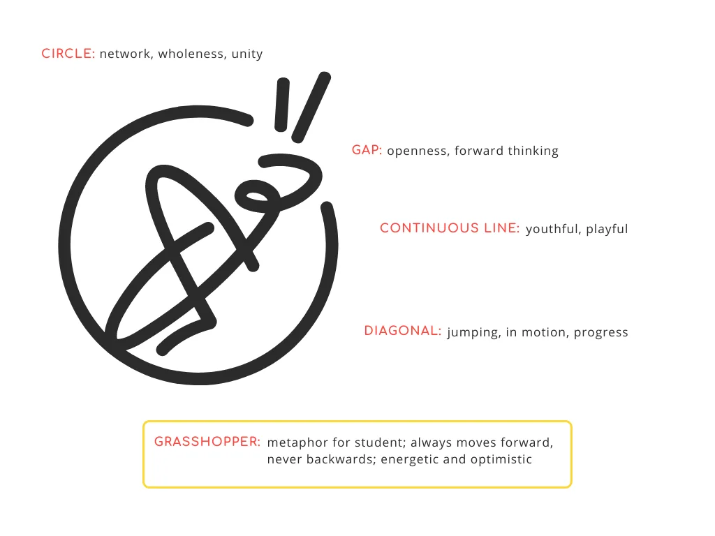
The grasshopper, or saltamontes in Spanish, was chosen as the name and mascot of the nonprofit because it embodies both the vitality and values of the brand. As a metaphor, the grasshopper’s ability to only jump forwards, never backwards, represents our optimism and forward thinking. The grasshopper’s lively movements are a symbol for energy, freedom, and flexibility, and its unique ability to undergo metamorphosis serves as an example of incredible adaptability and potential for growth and development. Similarly as an organization, we strive to provide young people with the tools and resources they need to be dynamic, innovative, and adaptable and to unlock their full potential.
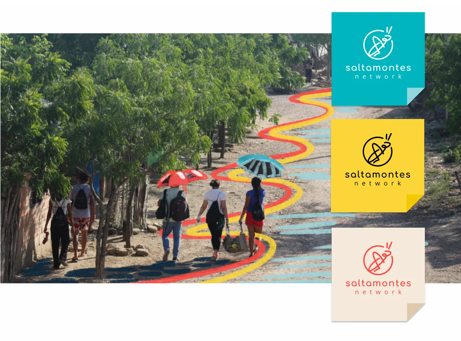
The logo was drawn in a single movement. It shows a grasshopper in motion, surrounded, but not trapped, by a circle that relates to the infinite bounds of the network the organization is building. The rounded, continuous line is much like a handwritten signature: it is distinguishable and easily recreated.
Typography
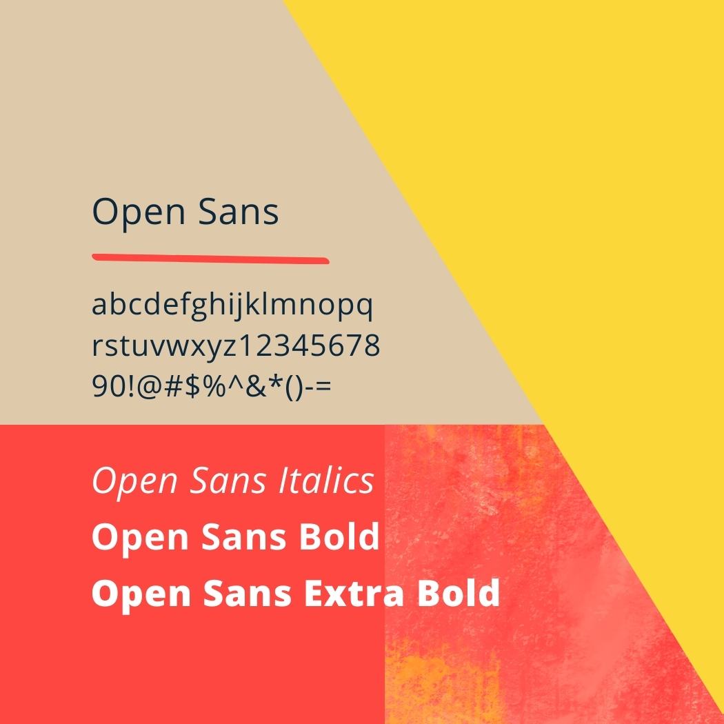
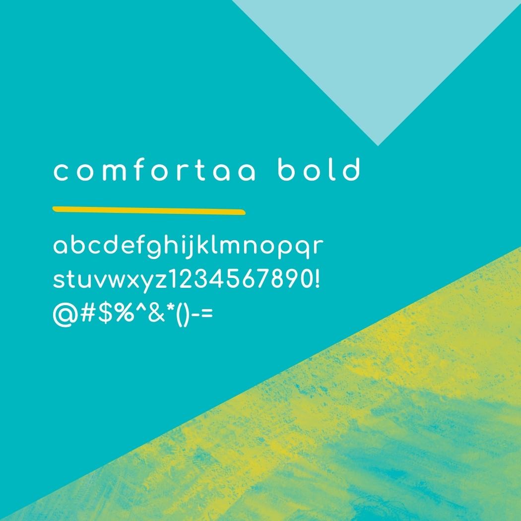
Our main font and logotype is a lowercase Comfortaa Bold – a rounded geometric sans-serif type design that mimics the stroke of the logomark. The font is downloadable for free on Google, making it easier for communities to use. The other half of the wordmark is a lowercase Open Sans. It is also a sans-serif font easily downloadable on Google but has more modern and professional flair. The combination of playfulness and seriousness through these fonts allowed us to appeal to our diverse audience.
Photography
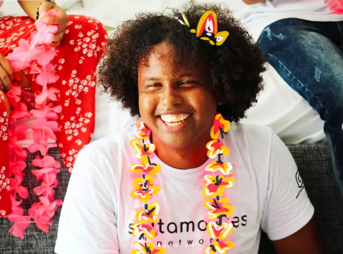
Our brand places a strong emphasis on perseverance, and as such, we are mindful to ensure that all subjects in our photography are portrayed in a positive light. We are conscious of the impact that images displaying helplessness and vulnerabilities can have on perpetuating misconceptions about populations and countries, and we make a deliberate choice to never present individuals as inferior.
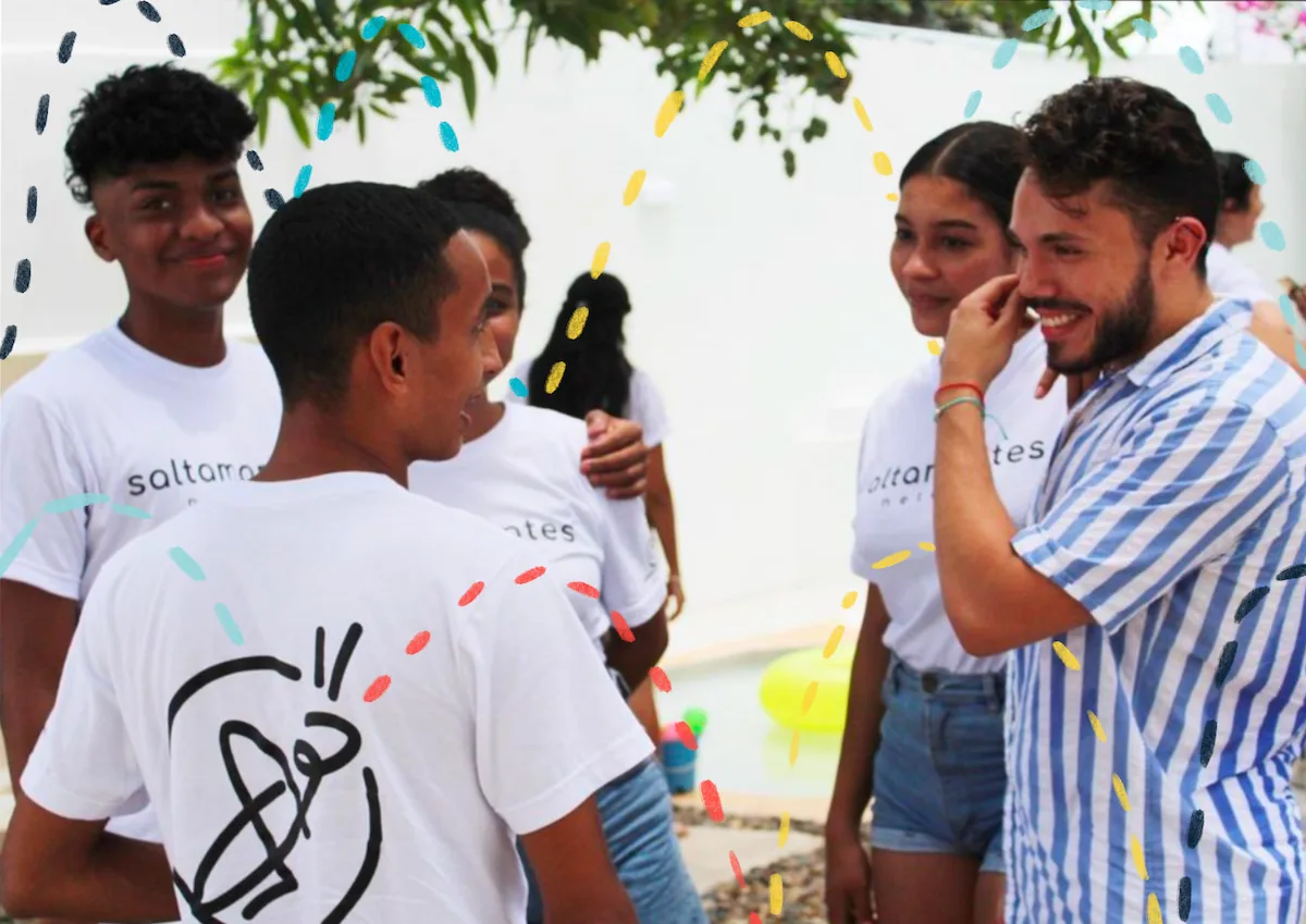
Our meticulous selection of imagery is designed to promote inclusiveness and equal representation. We prefer images with dynamic compositions, bright and vivid colors, and high resolution. To bring an extra special touch, we often incorporate minimalist illustrations directly onto the images. These playful illustrations add color and emphasize the mood and action captured in the photograph.


Results and Takeaways
Developing the entire branding for Saltamontes from scratch was an eye-opening experience that underscored the following takeaways:
- The importance of understanding the target audience: While at first we only considered our youth audience, we realized we would also need to build credibility among an older audience. This set our branding strategy in a whole different direction.
- The need for collaboration and communication: It was important to communicate expectations early-on to ensure we agreed on the same deadlines and deliverables.
- The value of research and planning: We spent more time on researching competitors ( other nonprofits in the field), brainstorming, and planning than on the actual designing. Once we had a clear vision for everything the nonprofit stood for and represented, the design together naturally.
- The need for ongoing brand management: A branding project isn’t a one-time event, but rather an ongoing process of managing and maintaining the brand’s image and messaging. Although I created branding guidelines, there remains a need for training on branding use. This investment in workshops is worthwhile.
